
In this article, we will learn how to fix mobile usability issues for a WordPress website.
Having a mobile-friendly website is important since most people are searching on Google using a mobile device.
Let’s see how we can identify and fix mobile usability issues in WordPress.
Mobile Usability report in Google Search Console
Google Search Console has a separate Mobile Usability report. It lists all issues on your site that could negatively affect the user experience when browsing on mobile devices.
You can find this report in the Experience section of Google Search Console.
Open this report, scroll down, and you will see a list of mobile usability errors for your site:
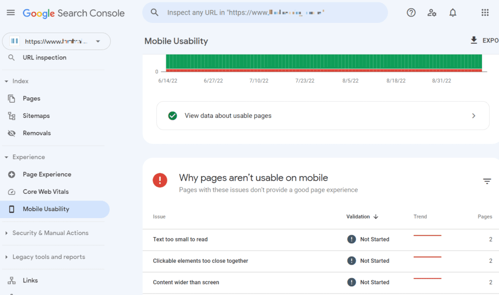
There are five main errors, which you can find in this report:
- Text too small to read
- Clickable elements too close together
- Content wider than screen
- Viewport not set [to “device-width”]
- Incompatible plugins.
You don’t necessarily need the help of a developer to fix mobile usability issues in WordPress.
If you are familiar with the basics of CSS and know how to use WordPress, you will be able to fix the errors yourself.
Let’s learn how to do it.
Text too small to read
This error occurs if you use a font size of fewer than 12 pixels since Google recommends using a font size that is at least 12 pixels:
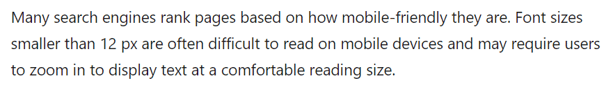
However, I would recommend that you use a font size of at least 16px. If the font size is less than 16 pixels, it may be difficult for visually impaired readers to read.
How to fix it in WordPress
Suppose you noticed the text on the page that looks smaller than 12 pixels:
In Google Chrome, select a piece of text with the mouse. Then right-click and select “Inspect”:
On the right side of the page, you’ll see a console with the source code of the selected element. Click “Styles”, and find the font-size attribute – it is the font size of the text:
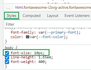
The font size of the text in this example is 10 pixels. To increase it, we need to change the value of the font-size attribute from 10px to 16px.
First, copy the font-size attribute together with the object (in this example – body) that contains it:
body {
    font-size: 10px;
    line-height: 1.65em;
    font-weight: 400;
}
In the code, remove those attributes that will not be changed, and set the necessary value for the font-size (e.g. 16px):
body {
font-size: 16px;
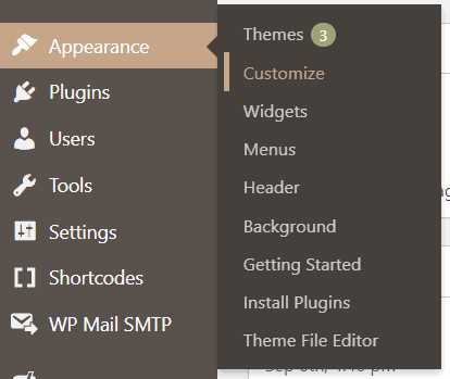
}Then go to the WordPress admin dashboard and select Appearance – Customize:
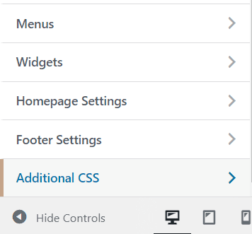
and click Additional CSS:
Paste the code from a new line and click Publish:
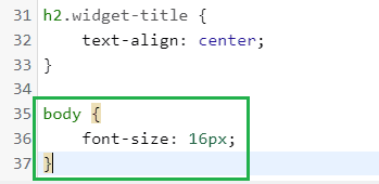
That’s it. The font size has been changed. Update the cache and the text should now have a font size of 16 pixels instead of 10 pixels.
Clickable elements too close together
This mobile usability issue relates only to “clickable elements” such as links, icons, buttons, etc., and does not apply to all elements on the page.
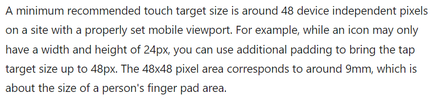
Google recommends that each clickable element should have a size that is not less than 48 pixels:
Here is a visual illustration:

How to fix it in WordPress
Suppose you have links in your footer and there doesn’t seem to be a 48px area for each clickable element:
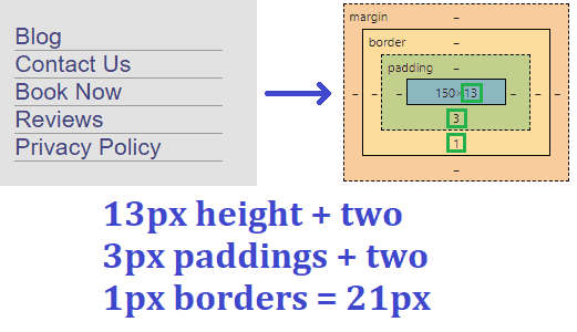
In this example, the element height is 13 pixels + two 3px paddings + two 1px borders = 21 pixels. This is less than the minimum recommended 48 pixels size.
To fix this error, you need to increase borders or padding (or set margins) so that the tap target size is at least 48 pixels.
For example, you can increase the padding to 9 pixels and set the margin to 10 pixels (13 + 9 + 9 + 10 + 10 = 51).
You can check the size of an element in Google Chrome: right-click on the element and select “Inspect”. Then choose “Styles” in the console on the right side of the page and scroll down:

As in the above example, copy the object with its attributes:
ul.footer-links li a {
    padding-bottom: 3px;
    margin-bottom: 3px;
    border-bottom: 1px solid #9a9a9a;
    color: #3b4183;
}
Then set the necessary value of the padding-bottom and margin-bottom attributes (9px and 10px respectively in this example):
ul.footer-links li a {
    padding-bottom: 9px;
    margin-bottom: 10px;
}
Then, by analogy with the previous example, go to the WordPress admin dashboard, select Appearance – Customize, and then select Additional CSS.
Paste your code from a new line and click Publish:

That’s all. Now the tap area around links in the footer is over 48 pixels, and this error has been fixed.
Content wider than screen
This issue occurs if some elements on the page are wider than the screen of a mobile device, so horizontal scrolling is necessary to read the entire line or view the entire image:

How to fix it in WordPress
The main idea here is to use only relative values in CSS declarations instead of absolute values.
As for images, a common way to fix this error is to assign all images max-width of 100% instead of an absolute value (e.g. 1000px).
So for example this is incorrect:
img {
  max-width: 1000px;
  display: block;
}
This is correct:
img {
  max-width: 100%;
  display: block;
}
For tables, the principle remains the same – use only relative values for width.
This is incorrect:
div.fullWidth {
  width: 300px;
  margin-left: auto;
  margin-right: auto;
}
This is correct:
div.fullWidth {
  width: 100%;
}
If other elements on the page use absolute values in the CSS declaration, you need to replace them with relative ones as in the above examples.
Viewport not set [to “device-width”]
viewport is a meta tag that defines how to adjust the page size to fit the screen size. This tag controls how a page is scaled for different screen sizes and different devices.
The tag is located in the header of a page. For example, this page has the following viewport meta tag:

So if you see the “Viewport not set” error, this means that the viewport meta tag is absent.
There is also another similar error “Viewport not set to “device-width”. This means that the viewport value width contains an absolute value (e.g. width=980px), which is incorrect.
These two mobile usability issues rarely occur for WordPress sites as they usually have a responsive web design.
How to fix it in WordPress
To fix the “Viewport not set” error for all pages, you need to add the following line of code to the header of the site:

To fix “Viewport not set to “device-width”, you need to make sure that the viewport value width is set to device-width:
width=device-width
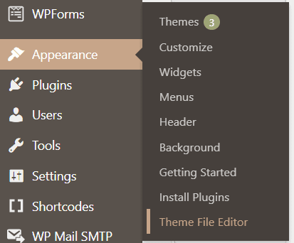
Typically you need to edit your header.php file to access the page header and find the viewport meta tag. However, the meta tag may also be in another file – it depends on your site theme.
To edit your header.php file, go to Appearance – Theme File Editor:
On the right side of the page find the section “Theme Files” and select the header.php:

Pay attention: it is highly recommended to back up the header.php before editing in case something goes wrong.
When you find the viewport meta tag, you need to update its value – set it to device-width.
If you don’t have the viewport meta tag, you need to add it to the head section of the page.

Please note: the above screenshots are just examples, the viewport meta tag in your theme might be in a different part of your header.php file, or even in a different file.
More detailed information on how to set the viewport you can find here:
https://web.dev/responsive-web-design-basics/#viewport
Uses incompatible plugins
This error means that your page contains plugins, which use obsolete technologies such as Flash or Silverlight. They are incompatible with Google Chrome and most other mobile browsers.
How to fix it in WordPress
You need to review installed plugins on the site and remove those plugins that use technologies such as Flash or Silverlight.
Replace them with plugins that use modern web technologies such as HTML5.
Validate fix in Search Console
Let Google know about the fixes you made. Go to the Mobile Usability report, click on the error you fixed, and you will see the “Validate Fix” button:

You have to do this for each mobile usability issue separately. When requests are submitted, it will take some time for Google to check them.
Conclusion
To ensure the best user experience on mobile devices, you need to make sure that the mobile version of your site is convenient for users.
To achieve this, you need to fix mobile usability issues and also improve Core web vitals for your WordPress website.
I hope that this article will help you with this.
5 Comments
Beau
Thank you for this! Very helpful to make sure my site is mobile friendly.
Volodymyr
Perfect post! I used your advices for my company website, and fix old mobile usability problems. Thank’s!
P. S. I subscribe for you blog at Feedly )
Raj
I solved the issue use this method 🙂
Thank you, useful Information to all websites runners.
Ken Hook
Excellent post! Your instructions helped me fix the mobility issues myself!
Many thanks!
Twalhat
Thank you very much